
The sleek, minimalist dashboard, dominated by a single, expansive touchscreen, was once the pinnacle of automotive modernity. It promised a future of clean lines and infinite customizability. Yet, for many drivers, this digital dream has become a daily frustration. Fumbling through menus to adjust the air conditioning, battling greasy fingerprints, and taking your eyes off the road for what feels like an eternity to change a song has sparked a significant movement. This is the button backlash. A growing chorus of consumers, safety advocates, and even car manufacturers themselves are acknowledging a simple truth; not everything is better on a screen. The satisfying, tactile click of a physical button is making a triumphant return, not as a nostalgic throwback, but as a superior solution for in-car interaction. This review explores the depth of this backlash, from the safety data that condemns over-reliance on touchscreens to the automakers who are masterfully blending digital displays with the common sense of physical controls. We will journey through the science of tactile feedback, celebrate the champions of ergonomic design, and look at what the future of the truly smart dashboard really looks like. It is a future where technology serves the driver, not the other way around.
The rise and fall of the all-touchscreen dashboard
The automotive industry’s love affair with the touchscreen began with a desire to emulate the consumer electronics world. The clean, futuristic aesthetic popularized by Tesla and the smartphone industry was incredibly seductive. For automakers, the appeal was twofold. Firstly, it projected an image of being on the cutting edge of technology. A large, vibrant screen became a visual centerpiece, a powerful marketing tool that screamed ‘modern’. Secondly, it offered significant manufacturing advantages. Consolidating dozens of physical switches, knobs, and buttons into a single software-driven display simplified the dashboard’s construction and reduced the bill of materials. A single hardware unit could be updated over the air, offering new features and layouts without a physical redesign. This seemed like a win-win. Early adopters praised the minimalist interiors and the novelty of the experience. However, as this design philosophy spread from luxury EVs to mainstream family cars, the practical drawbacks became glaringly apparent. Drivers found that simple, frequent tasks like adjusting volume, changing climate fan speed, or activating heated seats were now buried within complex menu systems. What once took a fraction of a second with a learned, tactile motion now required multiple taps and, crucially, visual attention diverted from the road. The screens themselves presented issues with glare in bright sunlight, a constant need for cleaning fingerprints, and occasional software lag that could make a simple input feel like a gamble. The promise of a seamless digital interface had, for many, devolved into a distracting and often infuriating user experience. The backlash was not just a matter of preference; it was brewing from a genuine decline in usability and safety.
Safety first the science behind tactile feedback
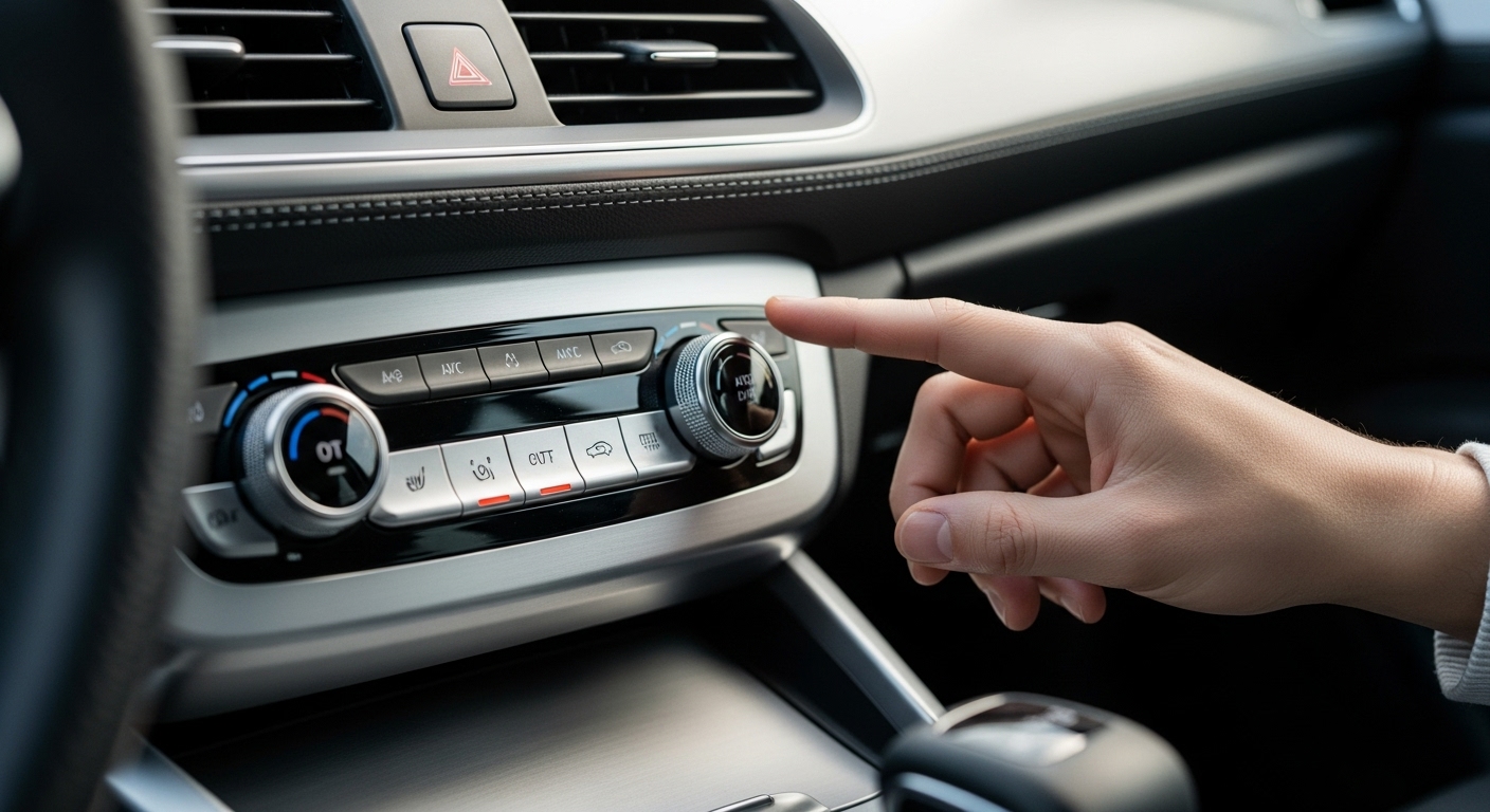
The core of the argument against touchscreen-only interfaces is rooted in safety and cognitive science. Driving is a demanding task that requires constant visual attention. Every moment a driver’s eyes are on a screen is a moment they are not on the road. A landmark study conducted by the Swedish automotive magazine Vi Bilägare dramatically highlighted this danger. They tested drivers in various modern cars, timing how long it took to perform simple functions like turning on the defroster or changing the radio station. The results were stark. In a 2005 Volvo with purely physical controls, performing these tasks took a driver just 10 seconds. In modern cars with touch-heavy interfaces, the same tasks took up to 45 seconds. At highway speeds, that represents a significant distance traveled with the driver effectively blind to their surroundings. This is because physical controls leverage muscle memory and proprioception, our body’s ability to sense its own position in space. A well-placed volume knob is always in the same spot. A driver can reach for it without looking, their fingers recognizing its shape and function, and the resulting click or turn providing instant confirmation. This is called tactile feedback. A flat, featureless glass screen offers none of this. Every interaction requires visual confirmation, first to locate the virtual button and then to confirm the input was successful. This process significantly increases a driver’s ‘cognitive load’, the total amount of mental effort being used. When cognitive load is high, reaction times slow, and the risk of missing a critical event, like a pedestrian stepping into the road or the car ahead braking suddenly, increases exponentially. Regulators and safety organizations like Euro NCAP are now taking notice, with proposals to reward manufacturers who retain physical controls for essential functions in their safety rating systems.
Champions of the click automakers leading the charge
Amidst the wave of screen-centric design, several automakers have wisely held their ground or are actively course-correcting, earning praise from both critics and consumers. Brands from the Hyundai Motor Group, including Hyundai, Kia, and Genesis, have been particularly lauded for their user-friendly interiors. They have successfully integrated large, modern infotainment screens while retaining dedicated physical buttons and knobs for high-frequency tasks. In a new Hyundai Palisade or Kia Telluride, for instance, you will find a neat row of clearly labeled buttons for climate control and shortcuts to key infotainment menus located just below the main screen. This ‘belt and suspenders’ approach provides the best of both worlds. You get the rich visual information of a screen for navigation and media, combined with the instant, no-look accessibility of physical switches for volume, tuning, and temperature. Mazda is another brand that has built its entire interior design philosophy, called Jinba Ittai or ‘horse and rider as one’, around minimizing driver distraction. Most of their vehicles use a rotary commander knob on the center console to navigate the main screen, which is intentionally placed far forward on the dash to discourage touch inputs while driving. This system, paired with physical climate controls, allows the driver to manage the car’s systems with minimal eye movement away from the road. Even Honda, known for its practical interiors, has been celebrated for the satisfyingly clicky and high-quality feel of the switchgear in models like the latest Civic and CR-V, proving that good ergonomic design is not exclusive to premium brands. These manufacturers demonstrate a deep understanding that the ultimate luxury is not a bigger screen, but a safer, less stressful driving experience.
Product Recommendation:
- Fit for VW Fit for Golf 7 MK7 Fit for Golf 7 Car Bumper Fog Lamp Grille Cover Trim Body Kit 2013-2016 Tuning(Carbon Look)
- EVIL ENERGY 10AN Female to 5/16 Barb Hose Fitting 45 Degree Swivel 2PCS
- TM-05-SI Aluminum Adjustable Rear Camber Arms, Set of 2 Left & Right, Compatible with Tesla Model S 2012-2021丨Tesla Model X 2016-2021丨Rear Camber Control Arms
- Audi 4K1064205A Pedal Caps DSG Interior Tuning Caps Stainless Steel with Footrest
- Ltd Compatible with Shift Boot & E Brake Boot for Mazda MX-5 Miata 1989-1997 Leather White Stitching
The luxury segment’s complex relationship with buttons
The push for massive touchscreens was largely pioneered by the luxury automotive segment, where visual drama and technological prowess are key selling points. Mercedes-Benz, with its sprawling MBUX Hyperscreen, a 56-inch curved glass surface that combines three separate displays, represents the zenith of this philosophy. Initially, it was hailed as a stunning piece of in-car tech. However, even Mercedes has had to acknowledge the usability challenges. Customer feedback has led them to refine the interface and, more recently, to announce a return to more physical controls in upcoming models. They recognized that even their most tech-savvy clients found certain operations cumbersome. A similar story unfolded at the Volkswagen Group. The launch of the eighth-generation Golf and the electric ID family was marred by widespread criticism of their new infotainment systems, which relied heavily on touch-sensitive sliders for volume and climate. These controls were unlit at night and provided no haptic feedback, making them notoriously difficult and frustrating to use. The backlash was so severe that the CEO of Volkswagen, Thomas Schäfer, publicly admitted the company’s mistake. He stated that the touch-heavy controls ’caused a lot of damage’ to customer loyalty and promised that future models would see a return of physical buttons and illuminated sliders. This public admission from a giant like VW was a watershed moment, signaling a major industry-wide pivot. It demonstrated that even brands selling a premium, futuristic image could not afford to ignore the fundamental principles of good, user-centric design. The lesson is clear; innovation for its own sake, without a tangible benefit to the user, is ultimately a failed experiment.
Not all buttons are created equal what makes a good control
Simply bringing back physical controls is not a guaranteed solution. The quality of implementation is paramount. A well-designed button or knob does more than just perform a function; it communicates with the driver through touch and sound. The ideal physical control has several key characteristics. Firstly, placement is critical. Controls for frequent-use items like volume, climate fan speed, and window defrosters should be located where they can be easily reached without leaning or stretching, allowing the driver to maintain a proper posture and view of the road. Secondly, differentiation is important. Drivers should be able to distinguish between different buttons by feel alone. This can be achieved through variations in size, shape, and texture. For example, a rotary knob for volume might have a knurled edge, while a toggle switch for drive modes might have a different feel entirely. This haptic differentiation aids muscle memory. The feedback from the control itself is perhaps the most crucial element. A good button has a positive, reassuring ‘click’ or ‘thunk’ when pressed. A quality knob offers a smooth, weighted resistance with distinct detents or steps as it is turned. This sensory feedback confirms the action has been registered without requiring the driver to look at a screen for confirmation. Contrast this with the worst examples of physical controls, like the flimsy, cheap-feeling plastic buttons found in some budget cars or the non-responsive capacitive ‘buttons’ that offer no tactile sensation. The goal is to create a satisfying and intuitive interaction, an area where brands like Audi and Porsche have historically excelled, with switchgear that feels engineered and substantial. The button backlash is not just a call for buttons, but a call for well-designed, high-quality controls.
The future is hybrid a balance of screens and switches
The complete eradication of touchscreens from car interiors is neither likely nor desirable. The button backlash is not about returning to the dashboards of the 1990s. Instead, it is about finding the intelligent middle ground, a hybrid approach that leverages the strengths of both physical and digital interfaces. The most forward-thinking automakers are now designing systems that do exactly this. A large, high-resolution touchscreen is undeniably the best tool for certain jobs. Displaying a complex navigation map, browsing a media library, or customizing vehicle settings are tasks perfectly suited to a graphical interface, and they are typically performed when the vehicle is stationary or by a passenger. However, for functions that need to be adjusted on the move, the safety and immediacy of physical controls are unmatched. The optimal dashboard of the near future will feature this dual approach. It will have a central screen for information-rich content, complemented by a row of physical buttons and knobs for core climate functions, volume control, and safety features like hazard lights and defrosters. Furthermore, other technologies will play a larger role in this balanced ecosystem. Voice controls are becoming increasingly sophisticated and are an excellent way to manage complex tasks without taking hands off the wheel or eyes off the road. Saying ‘Navigate to the nearest coffee shop’ is far safer than typing it. Similarly, advancements in haptic feedback technology may one day allow screens to provide localized vibrations or textures that simulate the feel of a real button, bridging the gap between the physical and digital worlds. This thoughtful integration is the true path forward, creating an environment that is at once technologically advanced, aesthetically pleasing, and, most importantly, fundamentally safe and intuitive for the person behind the wheel.
Conclusion
The great button backlash marks a pivotal moment in automotive design. It represents a course correction away from a trend that prioritized minimalist aesthetics over fundamental usability and safety. The initial allure of the all-encompassing touchscreen has been tempered by the harsh reality of driver distraction and user frustration. The data is clear, and the chorus of driver feedback has become too loud for automakers to ignore. Physical controls, with their inherent tactile feedback and reliance on muscle memory, are not relics of a bygone era; they are proven, effective tools for ensuring drivers can manage their vehicle’s systems while keeping their focus where it belongs, on the road. The manufacturers who are now being praised are not those who abandoned technology, but those who integrated it thoughtfully. They understood that the best interface is a hybrid one, a harmonious blend of vibrant screens for deep content and satisfying, reliable buttons for immediate actions. This movement is a victory for common sense and human-centered design. It serves as a powerful reminder that in the quest for innovation, the ultimate goal should always be to make our interactions with technology simpler, safer, and more intuitive. The satisfying click of a well-made button is more than just a sound; it is the sound of an industry listening to its customers and putting their safety first.