
The glow of a massive touchscreen in a dark cabin has become the hallmark of the modern automobile. We have moved far beyond simple radios with physical knobs. Today’s cars are powerful computers on wheels, and their operating systems are the central nervous system controlling everything from navigation and climate to vehicle dynamics and entertainment. But as features multiply, so does complexity. A frustratingly slow or confusing interface is not just an annoyance; it is a significant safety hazard. The battle for the most intuitive car operating system is heating up, with manufacturers realizing that a seamless user experience (UX) is as crucial to a buyer as engine performance or fuel economy. This digital cockpit is where the human-machine relationship is forged or broken. In this critical review, we will delve into the leading automotive interfaces, evaluating their design philosophy, responsiveness, and overall intuitiveness to compile our own interface index. We will explore the systems from legacy giants and tech-forward challengers to see who truly puts the driver first in this new digital era.
The gold standard of usability BMW’s iDrive
For over two decades, BMW’s iDrive has been a benchmark in the automotive industry, consistently evolving while retaining its core principle of driver-focused control. The latest iterations, iDrive 8.5 and iDrive 9, represent a masterclass in providing user choice and minimizing distraction. While many rivals have gone all-in on touchscreens, BMW wisely maintains a multi-modal approach. The iconic rotary controller on the center console remains a standout feature, allowing drivers to navigate complex menus with tactile precision without taking their eyes off the road for extended periods. This physical interaction is complemented by a highly responsive and vibrant curved touchscreen, sharp voice commands, and even gesture controls. The system’s menu structure is logical and relatively flat. A persistent climate control menu at the bottom of the screen ensures essential functions are always accessible, a design choice praised for its practicality. The introduction of the ‘QuickSelect’ feature in iDrive 8.5 further streamlines usability, allowing for one-touch access to frequently used applications like navigation or media directly from the home screen. The performance is buttery smooth, with near-instantaneous responses to inputs, which builds user confidence. By refusing to abandon physical controls and instead integrating them into a cohesive and modern digital framework, BMW proves that the most intuitive system is one that offers flexibility and respects the unique demands of the driving environment. It is less about flashy graphics and more about ergonomic intelligence.
Google’s automotive ambition Android Automotive takes the wheel
It is crucial to first distinguish between Android Auto and the more deeply integrated Android Automotive OS. While the former simply projects your phone’s interface onto the car’s screen, the latter is a full-fledged, native operating system running the car’s entire infotainment stack. Spearheaded in vehicles from Polestar and Volvo, and now expanding to brands like Honda and Ford, Android Automotive OS is a formidable contender for the usability crown. Its primary strength lies in its seamless integration of Google’s world-class services. Google Maps is not just an app; it is the native navigation system, capable of calculating routes based on the vehicle’s real-time battery or fuel level and planning charging or refueling stops accordingly. The true game-changer, however, is the Google Assistant. Its natural language processing is arguably the best in the business, allowing drivers to control everything from setting a destination to adjusting the cabin temperature with simple, conversational voice commands. This drastically reduces the need for manual interaction with the screen. The Google Play Store also brings a curated selection of automotive-approved apps directly into the car, independent of a connected phone. The interface is clean, familiar to anyone who has used an Android device, and generally very responsive. The main potential drawback is its reliance on the Google ecosystem; users without a Google account or those who prefer other services like Apple Maps may find it less appealing. Nonetheless, for a vast number of drivers, Google’s offering feels like the future, today.
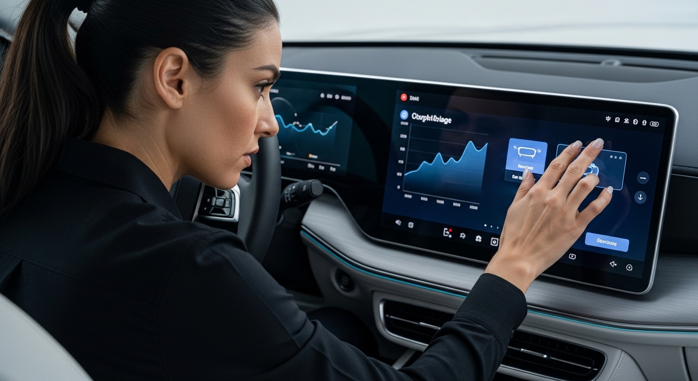
Mercedes-Benz MBUX The age of the hyperscreen
Mercedes-Benz has long been synonymous with luxury and technological prowess, and the Mercedes-Benz User Experience (MBUX) system is a testament to this legacy. In its most dramatic form, the optional MBUX Hyperscreen, the system transforms the entire dashboard into a single, 56-inch curved glass surface housing three distinct displays. It is a stunning piece of design that immediately communicates a sense of futuristic luxury. But beyond the visual spectacle, MBUX is impressively intelligent. Its key innovation is the ‘Zero Layer’ concept. Instead of forcing the user to hunt through menus and submenus, the system uses artificial intelligence to learn the driver’s habits and proactively display the most relevant functions and applications on the home screen. If you always call a specific person on your commute home, a suggestion tile will appear at the appropriate time. If you frequently use the heated steering wheel in cold weather, that shortcut will be front and center. This predictive interface aims to make 80 percent of the most common interactions available without ever leaving the main screen. The ‘Hey Mercedes’ voice assistant is another core component, continually improving its ability to understand natural speech and even engage in limited dialogue. While the sheer size of the Hyperscreen can feel overwhelming at first, the underlying software is remarkably adept at cutting through the noise and presenting what you need, when you need it. MBUX makes a bold statement that the most intuitive interface might be one that anticipates your next move.
Product Recommendation:
- Cat® MeshFlex Automotive Seat Covers for Cars Trucks and SUVs (Set of 2) – Beige Car Seat Covers for Front Seats, Truck Seat Protectors with Comfortable Mesh Back, Auto Interior Covers
- EVIL ENERGY 5/16 Barb Fuel Pressure Gauge Fitting Adapter with 1/8 NPT Sensor Gage Port Aluminum Black 2PCS
- 10 PCS Air Conditioner Valve Cover with Sign on Top, ABS High Pressure Cap Low Pressure Cap, Replacement Non-destructive Installation Tuning Accessory, for Most Cars (Black)
- For HONDA 06-11 Civic FD2 Shifter Trim (LHD Manual Only) Carbon Fiber Modified Tuned Tuning Car Body Parts Kits
- Car Phone Holder for Toyota Corolla/Corolla Cross Accessories 2019 2020 2021 2022 2023 2024 2025 Dash Mount Cell Phone Holder for Metal Ball Adapter Fit for Most Smartphones(8inch Screen Only)
Tesla’s minimalist approach Genius or gimmick
No discussion of modern car interfaces is complete without addressing Tesla, the brand that arguably kickstarted the large-touchscreen revolution. Tesla’s philosophy is one of extreme minimalism, consolidating nearly every vehicle control into a single, large central display. There are no traditional instrument clusters behind the steering wheel in the Model 3 and Model Y; even your speed is displayed on the main screen. The software itself is incredibly fast, fluid, and benefits from frequent over-the-air updates that add new features and refine the user experience. The navigation and energy planning are top-tier, and the entertainment options are plentiful. However, this minimalist approach has become increasingly controversial. In a quest for ultimate simplicity and manufacturing efficiency, Tesla has removed physical stalks for functions like turn signals and windshield wipers in its newer Model S, Model X, and the Cybertruck. These are now controlled by haptic buttons on the steering wheel or through the touchscreen. Many long-term reviews and safety advocates have criticized this move, arguing that it forces drivers to take their eyes off the road to perform basic, muscle-memory tasks. Finding the glove box release or adjusting mirror positions requires a dive into screen menus. While owners often adapt, the initial learning curve is steep, and the cognitive load for simple actions remains a valid concern. Tesla’s interface is a powerful and slick piece of software, but its dogmatic pursuit of minimalism raises important questions about where the line between innovative design and practical usability should be drawn.
The challenger from Korea Hyundai and Kia’s connected car cockpit
Often flying under the radar compared to their German and American counterparts, Hyundai, Kia, and their luxury arm Genesis have been quietly developing some of the most user-friendly and well-rounded infotainment systems on the market. Their latest platform, known as the Connected Car Navigation Cockpit (ccNC), demonstrates a deep understanding of user needs by striking an excellent balance between modern touchscreen functionality and traditional physical controls. The interface is clean, with crisp graphics and a logical, icon-based layout that is immediately intuitive. What sets these systems apart is the thoughtful inclusion of a row of physical buttons and knobs for primary functions. You get dedicated, tactile shortcuts for ‘Map’, ‘Nav’, ‘Media’, and ‘Setup’, along with physical volume and tuning knobs. This hybrid approach is a triumph of ergonomics, giving drivers a quick, no-look way to access the most essential features. The system also allows for a high degree of customization, with user-configurable widgets on the home screen for at-a-glance information. Performance is snappy, with little to no lag when swiping between screens or loading applications. Unique touches, like the ‘Sounds of Nature’ feature that plays calming ambient soundscapes, show a focus on the overall cabin experience. By resisting the urge to bury everything in a touchscreen, Hyundai and Kia have created an interface that is both technologically advanced and refreshingly simple to use, making a strong case that the best design is often the most practical one.
The evolving landscape Physical buttons versus touchscreens
The great debate of the current automotive era rages on a simple question what is the safest and most intuitive way to control a car’s functions? The industry seems split, with brands like Tesla pushing a touch-only future while others like BMW and Hyundai advocate for a hybrid model. Recent data and regulatory trends suggest the pendulum may be swinging back towards tactile controls. In 2024, the independent safety organization Euro NCAP announced that starting in 2026, cars will need to have physical controls for key functions like turn signals, hazard lights, and windshield wipers to earn a top five-star safety rating. This move is a direct response to growing concerns about driver distraction caused by overly complex touchscreen menus. A commissioned study by a Swedish car magazine, Vi Bilägare, found that drivers in modern cars with few physical buttons took significantly longer and covered more distance while performing simple tasks compared to drivers in older vehicles. The cognitive load required to navigate a screen, even a well-designed one, is inherently higher than activating a physical switch that can be located by touch alone. The most intuitive systems reviewed here, like BMW’s iDrive and Hyundai’s ccNC, seem to have found the sweet spot. They leverage the beauty and flexibility of large displays for secondary information and complex settings while retaining physical, muscle-memory controls for frequent, safety-critical actions. The future is not a rejection of the touchscreen, but a more thoughtful integration of it.
In conclusion, the ‘interface index’ is no longer a niche concern but a critical factor in the overall quality and safety of a new vehicle. Our review reveals there is no single perfect system, but a clear trend emerges the most intuitive car operating systems are those that provide choice and prioritize reducing driver distraction. BMW’s iDrive continues to set the standard with its masterful hybrid of a rotary controller and touchscreen. Google’s Android Automotive offers unparalleled smarts and voice control, making it a powerful and intuitive choice for those within its ecosystem. Mercedes-Benz impresses with its predictive ‘Zero Layer’ AI, while Hyundai and Kia deliver a masterclass in pragmatic, user-friendly design. Even Tesla’s controversial minimalism offers lessons in software fluidity, though its recent removal of physical controls serves as a cautionary tale. As safety bodies like Euro NCAP begin to mandate physical controls for core functions, the industry is being guided toward a more balanced future. The best interface is not the one with the biggest screen or the most features, but the one that allows the driver to keep their hands on the wheel and their eyes on the road. The ultimate goal is a seamless partnership between human and machine, and the operating system is the very language they speak.